Ani Connor - The One to Watch
Written by Philip Warkander by Fashion TalesRestrictions have defined the way we live and plan our lives. We have been instructed to isolate ourselves at home, keeping the distance between us and the ones we love and normally share our lives with. It has been impossible to make plans, because who knows when this will have passed and things are back to normal? Who even knows what “normal” is anymore, after almost a year in semi-quarantine?
Ani Connor witnessed first-hand the shutdown of an entire creative industry in response to COVID-19. Not only were artists unable to perform in front of live audiences but also the people working behind and around the stage were severely affected. She decided to take action and created Lockdown Live. This allowed performances to be streamed online and thus connecting artists with audiences and ensuring a paid position for people in the music industry, even with the restrictions for gatherings and events in place: “For me, being an artist means to be generous, it is about sharing creativity with people around me. To be an artist is to be of service to others.”
All in all, it's been a busy year for Connor who, led by her creativity, found ways not only to survive but to thrive. Other than Lockdown Live, she created and funded her own charity live stream for a women’s shelter in Sweden, released her single and music video “Until Next Time”, began a design collab with Studio WMS, initiated and lead a live-streamed concert in Berlin with one of the world’s biggest fashion retailers and in the midst of all this, Connor also recorded her debut EP to be released later this year.
When asked how she managed to create all of this during a time when others shut down, she smiles;
“It is never only me. I may create the initiative of something, but I am always supported by family, friends, and colleagues. All my projects are the result of collaboration in one form or the other. The meetings between an idea and action. My coming EP is a perfect example of a meeting. In this case between me and musician extraordinaire, Hosiannah, who together with an army of beautiful individuals will work this piece with me. Ani Connors new single “My Brain”, releasing end of May, is another example of her ways of finding creative collabs with the goal of creating synergies and win-win situations. In this case, she has initiated a creative collaboration with Deadwood – a forward-thinking leather focused fashion brand that uses recycled leather to produce its vintage collection. “Self-made is never alone. Trust me. Music, or society even, will never survive or thrive through the restrictions given to us if we act as if we are alone.”
The pandemic has changed not only the music industry but also the world of fashion, a world well familiar to Connor who for a great part grew up in the industry. Fashion is an inherently social phenomenon, a means of wordless communication. For many, being isolated from other people has made them less interested in dressing up, even neglecting to change clothes or taking care of oneself on a basic level:
“I have been fortunate to have strong, loving, and intelligent women as my role models, both in my mother, grandmother, and sisters. Amongst many things, I was taught to wake up and be ready to face the world, to do good, not only to others but also to myself.
The importance to be present in the moment both when waking up and going to sleep. To give thanks for missions accomplished and adventures ahead.
For me, this is a sort of self-care, it’s about being kind to myself, of making sure that my body – which is the vessel that carries me until it is no longer – is at ease and relaxed. Sometimes when I’ve worked really intensely, I realize that I have forgotten to take care of myself, and those are the times when it is particularly important to take a step back, to allow oneself a moment of rest.”
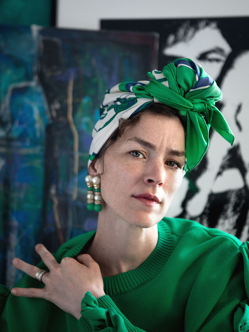
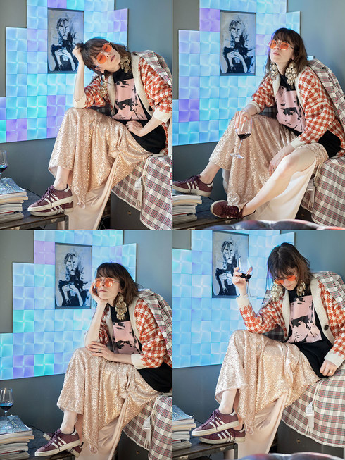
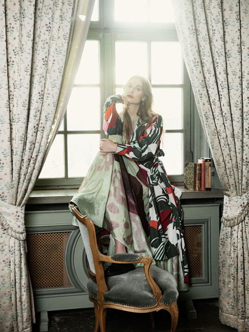
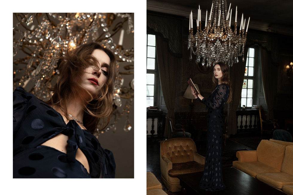
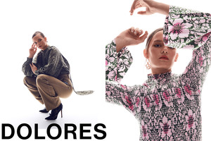
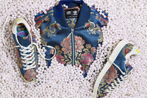
“I do try to see the change in everything as an opportunity to be creative, including the way we dress. Comfort has always been important to me and probably more so during times like these where we are more freed from conceptions on how we “should” be mixing materials and moods. I don’t shop often, but when I do it’s most likely at H&M, who I find are often faster than most in offering both essentials along with interesting collabs, that I often combine with vintage design pieces. For this shoot most pieces are from “Boutique Två Tre Gånger”, a small vintage shop in Stockholm who are responsible for most of my wardrobe along with brands like Acne, Avance or Byredo who I feel are daring and brave not only in design but also in terms of creativity and communication.”
For many creative minds, inspiration comes in waves. No one really knows where creative impulses come from, or how long they will linger if not nurtured. In many ways, creativity is like the sea; sometimes completely still, at other times in full storm and impossible to navigate securely. Can creativity be tamed, or does it have an agency and will of its own, independent of the humans that express it? And, how does this translate to the planning of creative work on a daily basis?
“I value my time. ‘Time’ is really just another word for ‘life’, and I know that if I want to achieve the goals that I have set for myself in life, it is necessary that I spend my time wisely. I’m grateful and humble for the opportunities that I have been granted, but I also take pride in my accomplishments. That’s also why I strive to be present in the moment; I regularly take a step back, examine the situation I’m in and ask myself if this is what I really want to be doing. Does my day look like I want it to, or have I allowed myself to be side-tracked? If so, what can I do to get back to what I actually want to be doing with my time? I think it is important to ensure space for creativity to flourish and be expressed, otherwise it might turn into bitterness and resentment.”
Cultural expressions such as music, literature, art, and fashion play a pivotal role during a crisis. When faced with an external threat, we need to find comfort and take shelter in human expressions that have the capacity to unify and bring us together.
“I love being creative, it gives me so much energy to be making music and I don’t really separate work from free time – my family are often present backstage when I perform, my colleges and musicians are my friends, but it is also very hard work and it is important to remember to keep the balance between work and rest. Stress is the most stupid illness you can give yourself.”
Listening to Ani Connor’s music as always sang with her deeply personal and instantly recognizable voice, one might (at least temporarily) forget the dreariness of life during a pandemic. When faced with uncertainty, it is more important than ever to live in the now and to value every fleeting moment. However, it is also essential that this spiritual approach to life is balanced with critical thinking or, as Connor adds when explaining her philosophy:
“I like sentences that begin with ‘what if’. We shouldn’t take anything for granted, we should never stop asking questions, even uncomfortable ones that might lead to difficult answers about how we spend our time and what we do with our lives. Question everything”.

